Nyquist Plot Generator
This app will generate the Nyquist Plot given a transfer function of the form (a + bs) e-ts / (g + hs). Nyquist plots are useful for analysing system stability.
Download
Nyquist.xlsxHow to use
Key in the values of a, b, g, h and t into the sheet, along with the frequency range for the plot. Note that the units of frequency is rad/time.
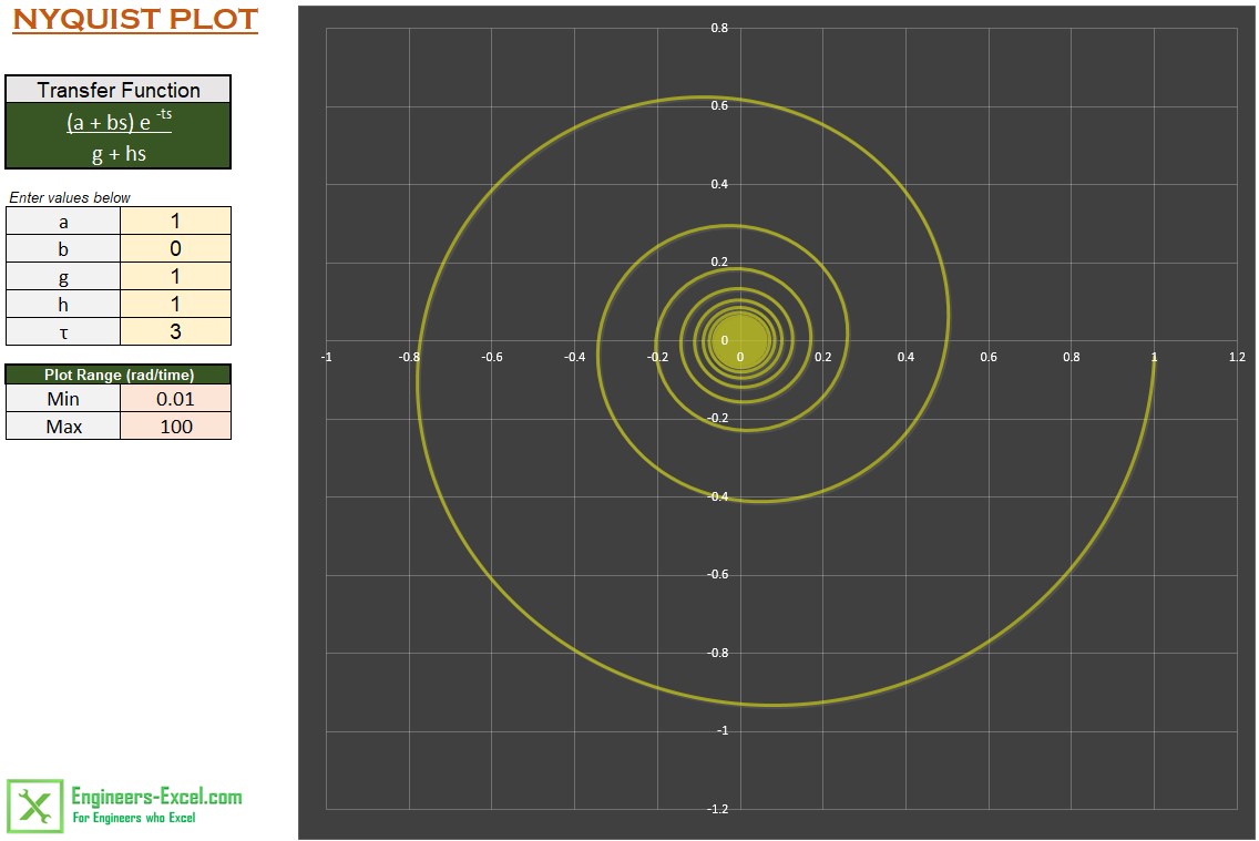
For example, the screenshot above shows the Nyquist plot for e-3s/(1 + s), from 0.01 rad/s to 100 rad/s. We have
a = 1,
b = 0,
g =1,
h = 1 and
t = 3.
How it works
This tool is similar to the Bode Plot Generator. The amplitude and phase are calculated at 1000 points over the frequency range using defined names and formulae. All formulae are evaluated in the memory, there are no calculations done directly on the spreadsheet. See the How Bode Plot works page for details of the formulae used.
There are 2 additional formulae used in this app, these calculate the X and Y axis values for the plot. These formulae are:
Xaxis = Amplitude * cos(Phase); and
Yaxis = Amplitude * sin(Phase).
These values are plotted on the X-Y chart to produce the Nyquist plot.
Note that in this app, the phase is calculated in radians and not degrees as in the Bode plot app.